Connect for Lemmy App

2670 readers
4 users here now

A community for the mobile app Connect for Lemmy.

Links

founded 1 year ago
MODERATORS
26


Blocking a user hides their content in comments, but it still shows up in inbox when viewing all as well as in comment chains in the profile view. It would be great if blocked users didn't show up in these places.

Let me know if there's more info needed.

27


Version: 1.0.187 (187)

Hardware: Google Pixel 7

Expected behavior: When swiping "back" on the main/posts page, expect to see "Are you sure you want to exit? Y/N"-type notification. "No" will return you to the app, whereas "Yes" will "close" the app (as in, reopening the app is a fresh open, not 'pick up where you left off'/minimize)

Observed behavior: Swiping "back" on the main/posts page just minimizes the app

28


I just upgraded from a Galaxy J7 to a Pixel 3, which seems to have fixed the following problems:

  • Clicking on my profile shows me someone else's profile

  • Refreshing immediately after changing profiles results in no block list being applied

So, it seems those issues were specific to older hardware.

I am still seeing the issue where trying to save redgifs videos in-app only saves a stub file instead. Though, seeing as redgifs made their videos unsaveable in browsers, maybe this is due to deliberate site shenanigans. Voyager seemingly also can't do this. Though, Voyager doesn't download anything at all, as opposed to Connect's stub files. If the resulting file is non-functional, I think saving nothing would be better, ideally with an error message saying the file could not be saved.

29


Just a quick observation: I cannot scroll the entirety of the comments within a post that extend beyond a few lines. I can collapse comments and get a bit further but it hits an invisible wall. I have tried adjusting my scroll settings within DeX and the issue persists. I just wanted to make a post for awareness - I am grateful for Connect and it works perfectly for me within the intended phone/app mode. Cheers!

30
2
Modifying comment styles (self.lemmyconnect)
submitted 3 months ago by Sammirr to c/[email protected]


Using a new device, I'm finding that top level comments for posts don't have much by way of padding or margin on the left (or right). On this new device, these comments can be difficult to read due to a curved screen. Is there a way I can somehow add some padding?

31


I mentioned this in a comment but I figured it would get lost there.

The recent update means redgifs videos now load (yay) but reveals a new problem: videos cannot be saved in-app. Attempting to do so (with file permissions enabled) instead saves a tiny file with the same name, but none of the data.

As redgifs disallows saving from their site in-browser, this effectively makes redgifs content unsaveable.

Any solution or workaround would be appreciated.

32
9
submitted 3 months ago* (last edited 3 months ago) by [email protected] to c/[email protected]


Could we please have the navigation bar be transparent?

33


I'd like to see an option to open a particular post as a different user. Mastodon clients have this and I find it pretty handy.

ie. Clicking the menu on a post should have "open as" which then lets you select one of your other logged in identities, and switches back to the post from that account.

34


This sounds like a really cool feature if not to difficult to add. https://dubvee.org/post/1621850

35
36
6
submitted 3 months ago* (last edited 3 months ago) by [email protected] to c/[email protected]


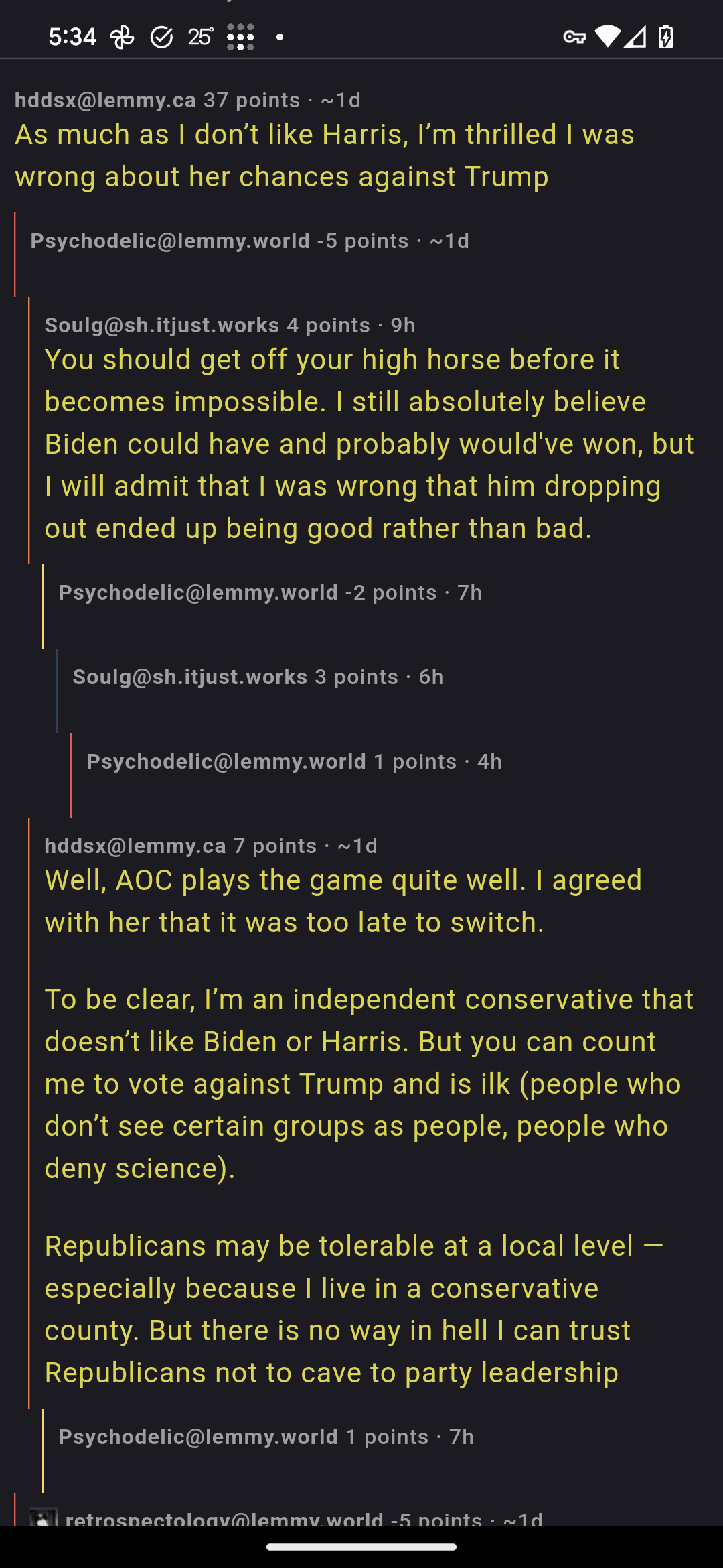
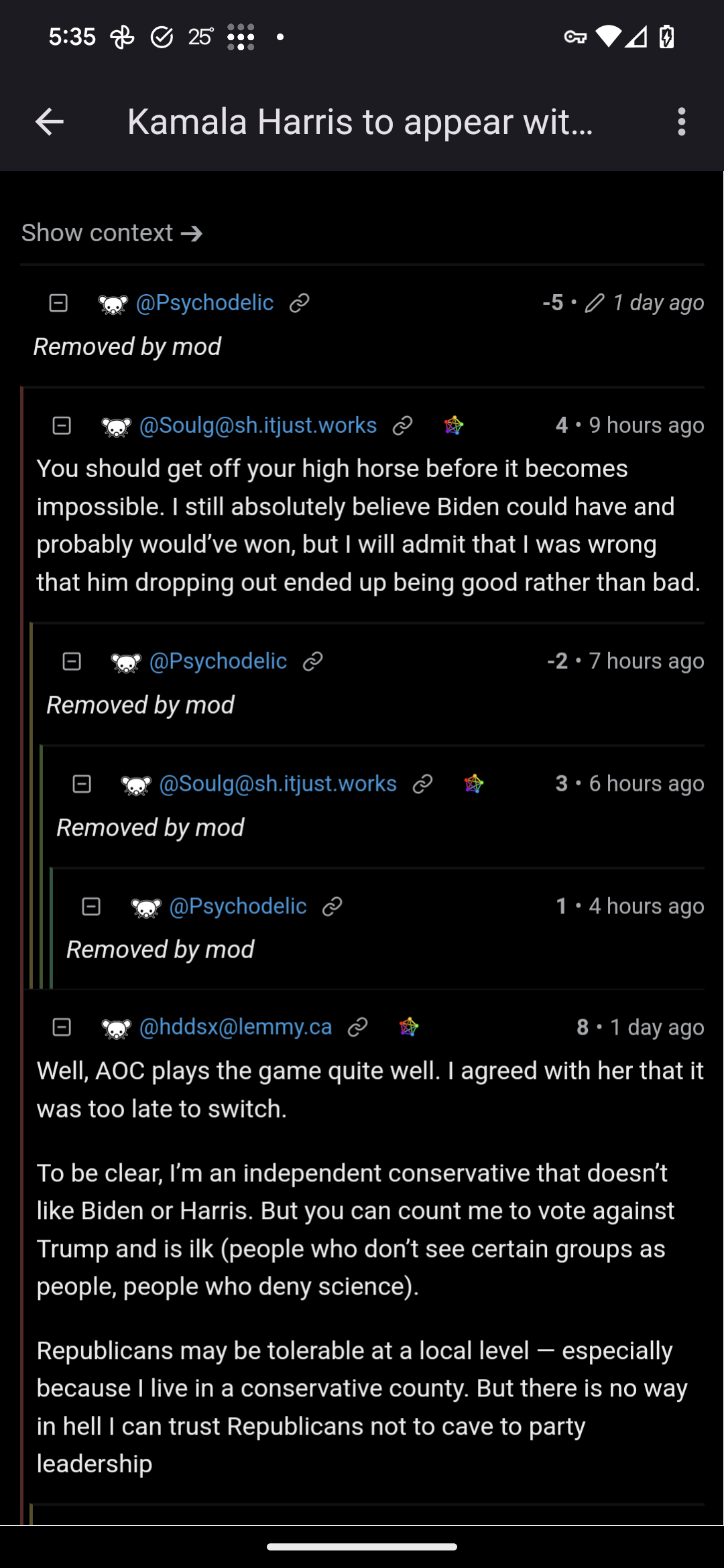
I've noticed a lot of blank comments that look active. Opening the comment in a browser shows it was removed by a mod. So those mod messages aren't being displayed. Here are a couple of screenshots showing the problems:

In Connect.

In Firefox

Example post: https://lemmy.world/post/18146992

37


Just curious if there is a way as I've been subscribed to a couple now that just vanished out of nowhere and it's a bit annoying to have dead instances on the switch screen.

38


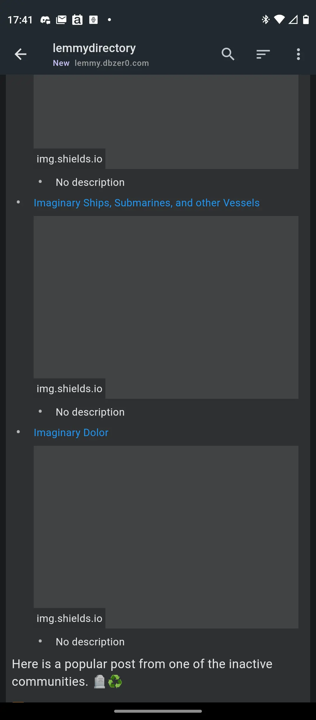
I'm not sure why but shields.io images don't display in Connect.

39


The MediaBiasFactChecker bot leaves comments that I like to see so I don't want to block it....but it's designed for how the browser version of Lemmy handles spoilers. It says "(click to view the whole report)" which expands the multiline comment.

On Connect, the entire spoiler section shows up (but blacked out, of course).

Honestly I prefer the way Connect handles it now but I don't expect the bot maker to change their formatting to cater to just one app so an option for it would be awesome

40


This is after I click on View All in my Inbox. Thanks!

41


The display of inline images in posts is not very good (they are often a bit small). Sometimes they aren't too bad - the second image is ok but not as large as it could be, but the top one is tiny. Can this be improved?

42


Spinner shows while thumbnail is being shown after upload and thumbnail is being generated, but not when actually uploading. (I am attempting to attach gif to this post, but not sure if upload has failed, still going or just not possible.)

I am mobile while I am creating this post, so uploads are laggy anyway.

43


Today I've visited TechCrunch from a posted link

https://techcrunch.com/2024/07/24/crowdstrike-offers-a-10-apology-gift-card-to-say-sorry-for-outage/

and after some reading couldn't exit it at all tapping both my back key and the back arrow on the top.

Due to how inconvenient the arrow on top is, I suggest to make it the exit button that closes the browser and returns user to Lemmy at once, while usual back buttons keep acting like they are now.

44


This is super annoying, as I try to pinch gesture zoom in on an image, and I'll go out of the media back to the list again instead.

I'd like to click to already zoom in somewhat, making punch zoom even easier

If I want to get out, I'll press the back button on my phone, or the back button of connect

45


There used to be rounded rectangles around each post, now there's nothing separating it from the following post. I tried changing the colors and it's still gone.

Full Width had a bar between them so I'll use that for now...but I kind of miss the Card view showing cards

46


Search is fine, but there have been several cases where I have wanted to manually enter a community name and instance.

Search can be odd at times and being able to have connect at least attempt to jump to a community would be a nice to have.

47


Edit: I can now post and view cat pics. Yay!

Searching for "cat" or "cats" yields [email protected] with Connect, but not from web. "cat" is an invalid community.

[email protected] should be correct community and listed in search results.

48


Can this be fixed to collapse just the subcomment?

49
19
Amoled Background Error (lemmy.dbzer0.com)
submitted 3 months ago* (last edited 3 months ago) by [email protected] to c/[email protected]


Hey I've been using Connect for a while with the Amoled theme. Nothing makes me enjoy the app quite like a pure black background.

With the new release, the background of posts in the feed and comments in the post is not amoled black but dark theme black. The sidebar menu is also affected. This was incredibly jarring and I don't know how I can go on like this.

I appreciate the hard work and hope this is fixed soon, thanks

It has been fixed

50


Typing. !lemm

Or something should list suggestions like the web page does.

view more: ‹ prev next ›