this post was submitted on 09 Jan 2024
483 points (98.2% liked)
Funny
6756 readers
250 users here now
General rules:
- Be kind.
- All posts must make an attempt to be funny.
- Obey the general sh.itjust.works instance rules.
- No politics or political figures. There are plenty of other politics communities to choose from.
- Don't post anything grotesque or potentially illegal. Examples include pornography, gore, animal cruelty, inappropriate jokes involving kids, etc.
Exceptions may be made at the discretion of the mods.
founded 1 year ago
MODERATORS
you are viewing a single comment's thread
view the rest of the comments
view the rest of the comments

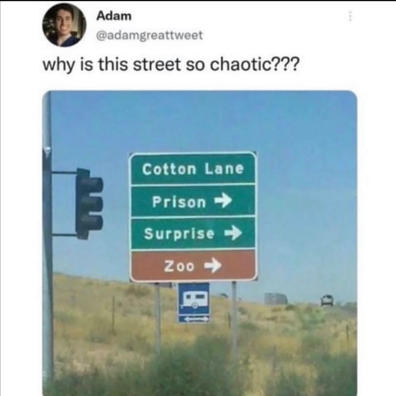
Actual answer for anyone curious: In the US, most public points of interest are marked by brown signs (parks, libraries, zoos, historical sites, etc.)
And "traveler facilities" are blue, right? Camping, gas/food/lodging, hospital, rest areas?
I'm trying to remember what I see every day now... I'm sure hospitals and the signs for food/lodging are blue. Maybe airports and train stations too?
When I picture signs for camp grounds, I imagine them as brown, but I could be wrong.
https://mutcd.fhwa.dot.gov/services/publications/fhwaop02084/index.htm
Why bother remembering when you can just look it up in the MUTCD?
Blue is just "informational"
Anything from upcoming ammenities to what radio station you should tune to for information during evacuations (hurricane evacuation routes have these regularly)
Ohhh so that's why "info" type components (toasts, modals, divs, whatever) are styled in blue for every CSS bootstrapping kit.