memes
Community rules
1. Be civil
No trolling, bigotry or other insulting / annoying behaviour
2. No politics
This is non-politics community. For political memes please go to [email protected]
3. No recent reposts
Check for reposts when posting a meme, you can only repost after 1 month
4. No bots
No bots without the express approval of the mods or the admins
5. No Spam/Ads
No advertisements or spam. This is an instance rule and the only way to live.
Sister communities
- [email protected] : Star Trek memes, chat and shitposts
- [email protected] : Lemmy Shitposts, anything and everything goes.
- [email protected] : Linux themed memes
- [email protected] : for those who love comic stories.
It is just an optical illusion the windows are actually lined up but the different colored bricks make you think they aren't. Look really closely, get your face real close to the monitor and cover up the bricks around the windows. Once you get in real close you will see I made the whole thing up and those windows are no where close to lining up, get your eyes checked.
I used a straight edge. They aren't lined up.
You aren't getting close enough.
Push your head through the screen.
Something something in nineteen-ninety eight...
Because a clueless user used the space bar instead of a table or tab stops.
Every word user is clueless.
Word itself is full of clues to use something else.
Or converted it from PDF to Word.
Or had to use the 365 version, which somehow is a thousand times worse. Like seriously, what kind of fucking drugs were they on when writing that piece of crap? Google Drive, Libreoffice, regular Word are all fucking perfect compared to that hellspawn. /rant
or Wrap Text > In Front of Text
In order for this to be accurate, the building plans would need to encoded so only the building designers have any clue how the building works and how safe it is.
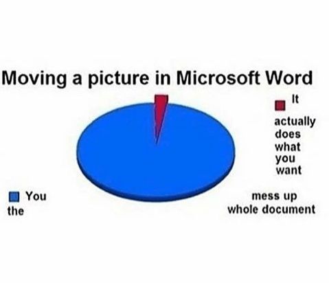
Also moving around random mundane objects in the building like a picture frame on an office wall not infrequently causes a cascading and horrendous displacement of all the other objects in the building.
To open the breaker box involves operating two sets of panels, first the building tries to get you to use the new updated breaker panel interface but it was designed by the portion of the company that was told to sell more "cloud rooms" which are tiny and full of cameras that monitor residents and serve ads to them over a preinstalled intercom, so the first panel hides all the normal rooms and you have to find a latch and a set of 30 screws that when removed allows you to access the old breaker panel with all the other rooms. Every single time you open the breaker you have to repeat this process.
There is a building supervisor that used to be at least somewhat helpful when residents had questions but they got replaced by a new person. The replacement confusingly advertises nearby chain stores to you when you call them up to ask about a plumbing issue and answers specific questions about the building they are in charge of oddly, as if they were questions about buildings in general all over the world.
I feel like I am missing some key things here, but this is at least a somewhat accurate starting point for a microsoft word building.
And then you hit ¶ and you see how it was done
···◫··········◫··
··◫··········◫··
····◫········◫···
····◫··········◫·
···◫·········◫···
Power bi. Next time the building loads they'll be shifted weirdly vertical randomly.
Power bi
Uhh does this mean what I think it means
Oh god what have you done. Forevermore I will think of this at work
I don't think so, but I'm not sure what else it might mean.
Of course it would be a Windows problem.
This happen because the user didn't use monospaced font /s
Be thankful they didn't use wingdings
there is actually a pattern of two windows being lined up, then an alternating shift, except at the top
I quite like it actually
If you tried to drag one of those windows over to line it up the building would literally explode.
junior grade architects
Can you repeat?
Using word wrap to align things.
They are straight, but they're in four columns, overlapping, even though it looks like two.
Looks more like it was designed in photoshop to me.
Mmm... stability design.
?
or that nokia game where you drop floors on buildings
