this post was submitted on 30 Jun 2023
5 points (100.0% liked)

wefwef

4218 readers
1 users here now

wefwef is now Voyager! Subscribe to [email protected].

founded 1 year ago
MODERATORS
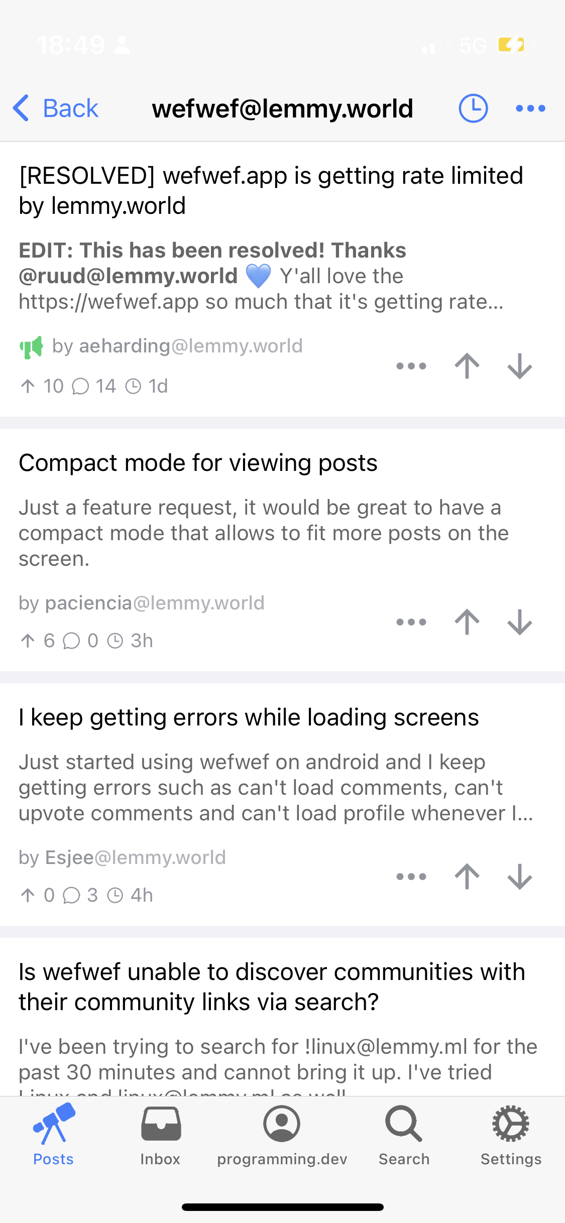
 

I posted this as an Issue on the GitHub, but I’m unable to reply without closing it: https://github.com/aeharding/wefwef/issues/44

In Light Mode (the default mode for iOS), the time, battery etc. is unreadable.

Perhaps there is a nerdy skew with early adopters, so does everyone testing have Dark Mode on all the time by default? I don’t understand how I seem to be the only one who has flagged this…

I prefer to have it auto switching, but I think the majority of people use Light Mode. Does anyone happen to know if there’s data to show which Mode is most popular?

For me, I find it very hard to use the app without being able to see the core UI of the phone.

This is also a big hit in regards to accessibility and I struggle to understand why fixing this wouldn’t be a priority.

top 1 comments
sorted by: hot top controversial new old
[–] [email protected] 1 points 1 year ago

First thing I noticed as well. Hope this will get fixed soon. I hate not being able to track the time or battery percentage while browsing redd… I mean lemmy.