this post was submitted on 05 Jul 2023
105 points (100.0% liked)

Connect for Lemmy App

2668 readers
2 users here now

A community for the mobile app Connect for Lemmy.

Links

founded 1 year ago
MODERATORS
 

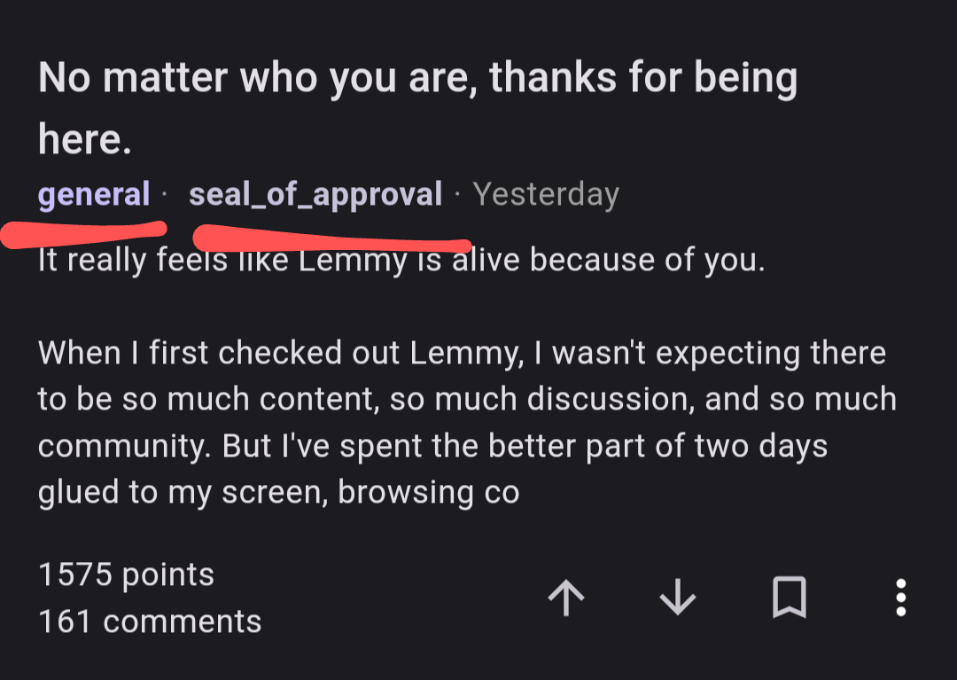
This is currently my primary frustration with Connect: complete opaqueness regarding instances.

I understand that one design philosophy might argue that instances shouldn't matter, so why show it at all. But it does matter, especially on All, and in comments. I think at the current and near-term state of development, obscuring instances creates more confusion than it alleviates.

  • In this example, I have no idea what community this is. Where is "here"? "General" is a super broad category (does a multi-community even make sense for this type of community name?). Is this /c/general for a general purpose instance, or /c/general of an instance dedicated to a very specific topic? Is that instance worth checking out? Who knows?
  • Is this an instance I'm subscribed to yet?
  • is this the same /c/general I was in last time with a moderation policy and moderators I didn't like, or a new one?
  • Is my instance defederated from seal_of_approval and will they receive my message? Who knows?
  • Are most responders coming from lemmy.world, from sketchy instances loaded with bots or is there good traction from smaller instances? Is there instance brigading going on?
  • Is this an impersonator of seal_of_approval?
  • is this a specific community that spams a lot and I should block it?
  • What moderation rules apply to this instance?

I can't block entire instances myself...

I realize that a lot of these problems have some sort of workaround by drilling down into community details and profiles. Ain't nobody have time for that.

I realize that specific UI solutions could be introduced to tackle each of these problems individually in a user-friendly manner. But we're not there and who knows when we will get there.

top 7 comments
sorted by: hot top controversial new old
[–] [email protected] 13 points 1 year ago (1 children)

Hi, thanks for the feedback! I originally hid the instance names because it does add a lot of visual clutter but I know that this is important to some users! I'll add a setting to show this and include it in the next release (tomorrow).

[–] [email protected] 3 points 1 year ago

Looking good!

[–] [email protected] 9 points 1 year ago (1 children)

I was using liftoff at first but Connect is much closer to the UI and feature set I want. I do want a way to see the instance in the list view, but that got very cluttered in liftoff. I wondered if maybe an option to deemphasize (smaller? Faded?) the instance in the community name might help it be less cluttered.

[–] [email protected] 2 points 1 year ago

Yeah, I agree there should be a way to easily see the instance. Maybe there could be like a long hold to show instance type feature?

[–] [email protected] 8 points 1 year ago

This is exactly why I'm not using Connect

[–] [email protected] 3 points 1 year ago (1 children)

I actually really like Connect for everything else. I'm using LiftOff at the moment for this reason alone, but as soon as there's an option to view the Instances I'll be right back.

[–] [email protected] 3 points 1 year ago* (last edited 1 year ago)

I just started using liftoff too because I heard it was faster but how come we can't interact with posts from other instances? I didn't have this problem with Connect.
EDIT: Okay I can vote on lemmy.world posts if it says "via [my instance]." I'm so confused what's the difference 😫
load more comments
view more: next ›