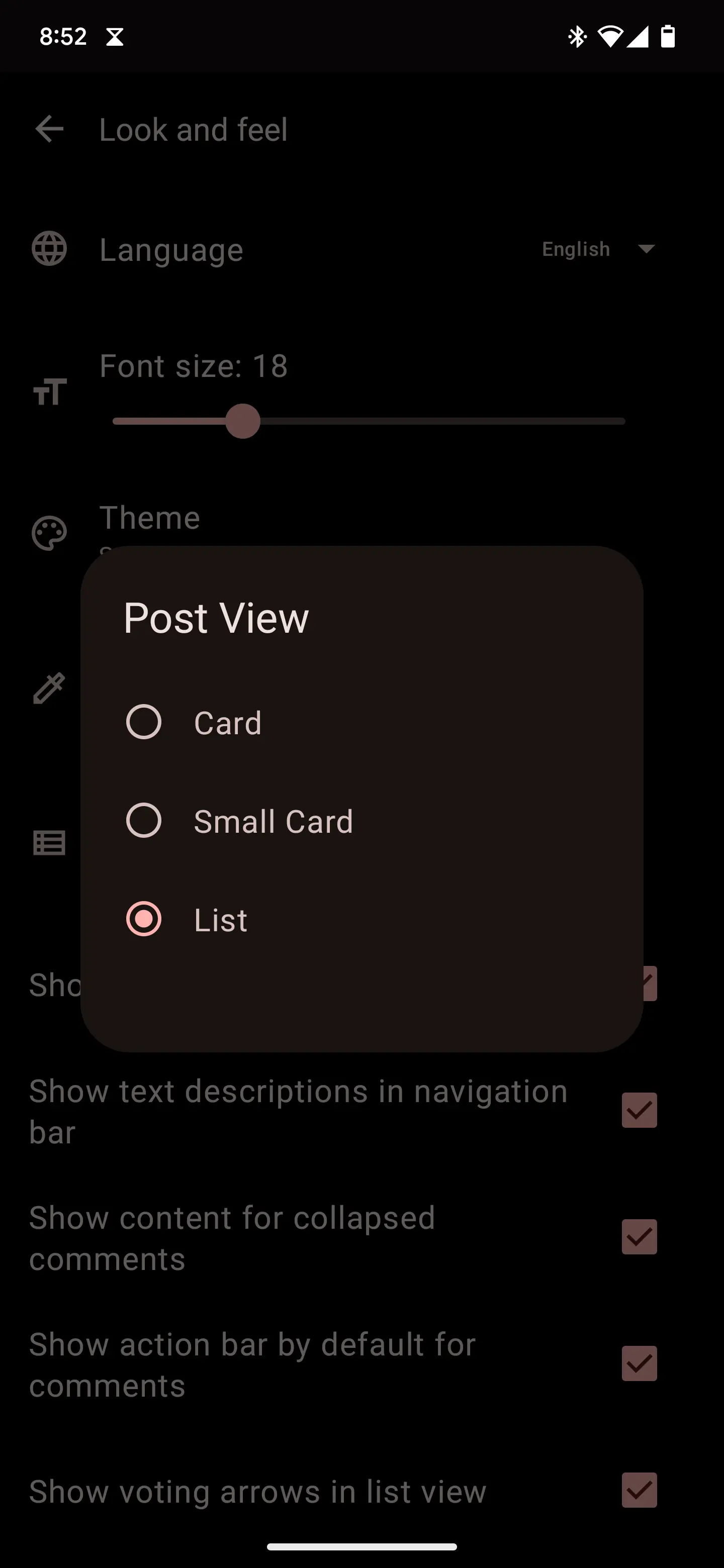
In Jerboa android app, Settings / Look and feel / Post view, pick list view.
Very similar format to the screenshot attached to the original post.
A home for discussion of Lemmy apps and tools for all platforms.
RULES:
An extensive list of Lemmy apps is available here:
Visit our partner Communities!
Lemmy Plugins and Userscripts is a great place to enhance the Lemmy browsing experience. [email protected]
Lemmy Integrations is a community about all integrations with the lemmy API. Bots, Scripts, New Apps, etc. [email protected]
Lemmy Bots and Tools is a place to discuss and show off bots, tools, front ends, etc. you’re making that relate to lemmy. [email protected]
Lemmy App Development is a place for Lemmy builders to chat about building apps, clients, tools and bots for the Lemmy platform. [email protected]
In Jerboa android app, Settings / Look and feel / Post view, pick list view.
Very similar format to the screenshot attached to the original post.
Wefwef app is now called voyager app. Try that
Connect with the "reverse card" view works exactly how you would like it

How did you got rid of the white bar separating post on connect?
its the Amoled theme I'm pretty sure
For me Amoled get black but keep the white bar :(
Weird. I was curious and double checked. It is indeed the stock amoled theme with the reverse card layout
Jerboa has List view:

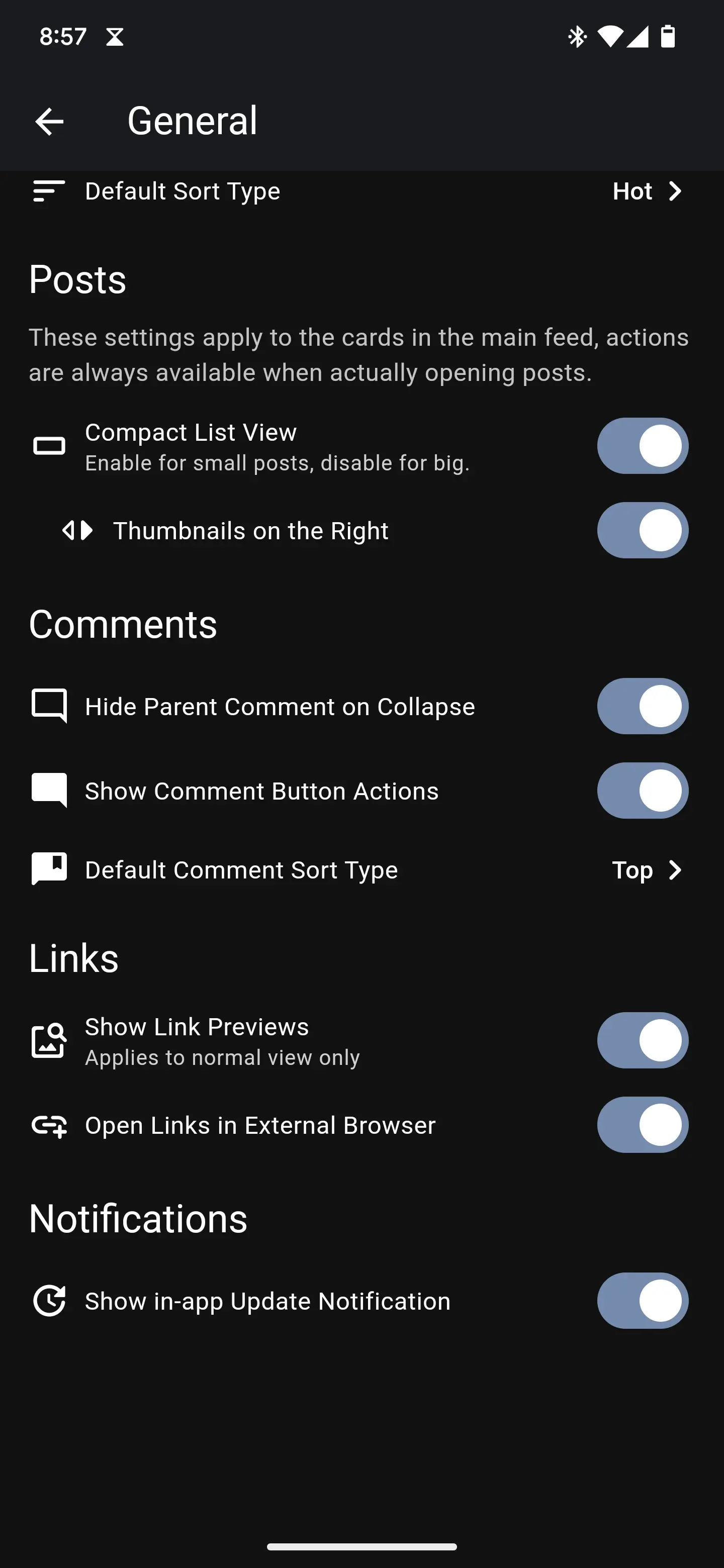
Thunder has a compact list view:

Basically every Lemmy/Reddit client does, including Liftoff. Not sure if OP poked around the settings to find the switch.
Voyager has the best compact mode I've found although the post. image preview is on the left instead of the right like on RIF. I still love the app and have been using it way more than any others.
Edit: there's a screenshot of Voyager in my post history. It was called wefwef at the time but it's still the same post design if you wanted to see what it looks like.
That looks like rif. Closest I've found is thunder and connect in compact mode.