Can I get these working on mobile?
Creative
Beehaw's section for your art and original content, other miscellaneous creative works you've found, and discussion of the creative arts and how they happen generally. Covers everything from digital to physical; photography to painting; abstract to photorealistic; and everything in between.
(It's not mandatory, but we also encourage providing a description of your image(s) for accessibility purposes! See here for a more detailed explanation and advice on how best to do this.)
Subcommunities on Beehaw:
This community's icon was made by Aaron Schneider, under the CC-BY-NC-SA 4.0 license.
Some mobile browsers might be able to use these themes, I've tried to make them as mobile friendly as possible! I think Firefox allows for installing extensions on mobile.
Are you able to truncate titles and content for mobile browsing?
I think I’ll need to do some more testing, would you mind sending a screenshot illustrating what you mean? Then I can give it a go.
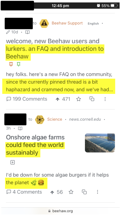
One post on mobile can take up more than half the screen in the feed - if the title and or text description is long. If we could truncate them then the feed is more compact.
So in this screen shot, ideally remove the highlighted by truncating with a set character limit for titles and descriptions.

I’m not sure that can be done purely in CSS, but I’ll have a look.
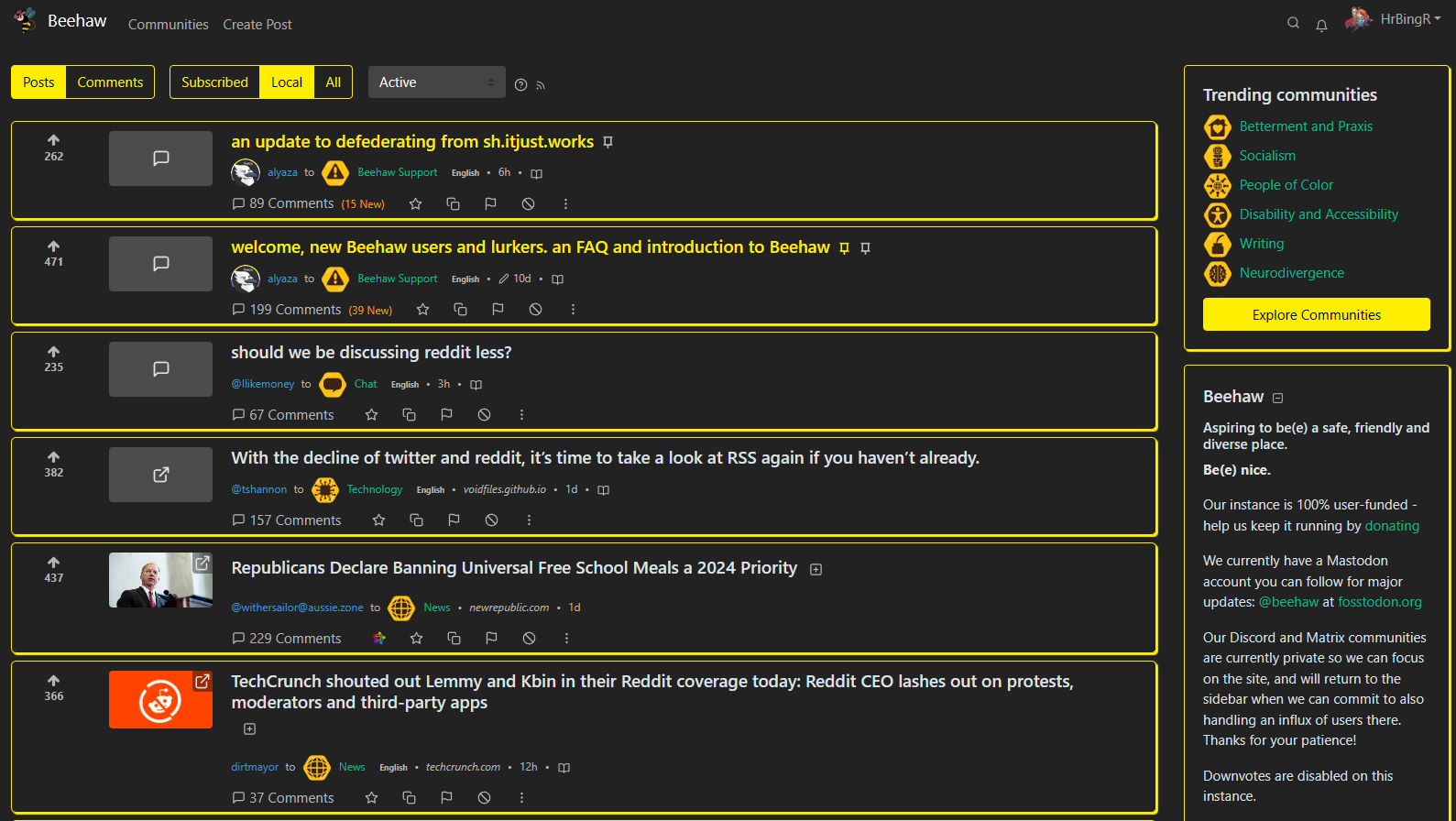
Ah, this is excellent! I really don't get why, and neither like, the feed on Lemmy pages is centered wasting so much screen space. For that alone I want to throw this onto my browser.
Honestly, that was my biggest reason for starting this up. It just kind of snowballed from there.
Okay, so I just had something weird happen. I was in the middle of replying to a thread further down (the Emet-Selch art) and this post displaced the post I was on. It did not displace the comments, and I was in all actuality still replying to the thread I had started reading, but visually this post had replaced the post I was on. Including the title.
And this made me realize I had it happen to me before and explains my confusion then. That previous time did not have quite this level of visual jarring to it, so I didn't notice immediately.
Is this a known bug?
Honestly, I have no idea; can't say that's happened to me, but it might be best to post about it in /c/support so the admins see the issue and can potentially look at a fix (if it's not already been reported to the Lemmy devs).
Yeah it's a known bug. One of the most reported ones ATM. Fingers crossed on a fix soon.
