this post was submitted on 27 Mar 2024
687 points (98.3% liked)
linuxmemes
21188 readers
878 users here now
Hint: :q!
Sister communities:
- LemmyMemes: Memes
- LemmyShitpost: Anything and everything goes.
- RISA: Star Trek memes and shitposts
Community rules (click to expand)
1. Follow the site-wide rules
- Instance-wide TOS: https://legal.lemmy.world/tos/
- Lemmy code of conduct: https://join-lemmy.org/docs/code_of_conduct.html
2. Be civil
- Understand the difference between a joke and an insult.
- Do not harrass or attack members of the community for any reason.
- Leave remarks of "peasantry" to the PCMR community. If you dislike an OS/service/application, attack the thing you dislike, not the individuals who use it. Some people may not have a choice.
- Bigotry will not be tolerated.
- These rules are somewhat loosened when the subject is a public figure. Still, do not attack their person or incite harrassment.
3. Post Linux-related content
- Including Unix and BSD.
- Non-Linux content is acceptable as long as it makes a reference to Linux. For example, the poorly made mockery of
sudoin Windows. - No porn. Even if you watch it on a Linux machine.
4. No recent reposts
- Everybody uses Arch btw, can't quit Vim, and wants to interject for a moment. You can stop now.
Please report posts and comments that break these rules!
founded 1 year ago
MODERATORS
you are viewing a single comment's thread
view the rest of the comments
view the rest of the comments

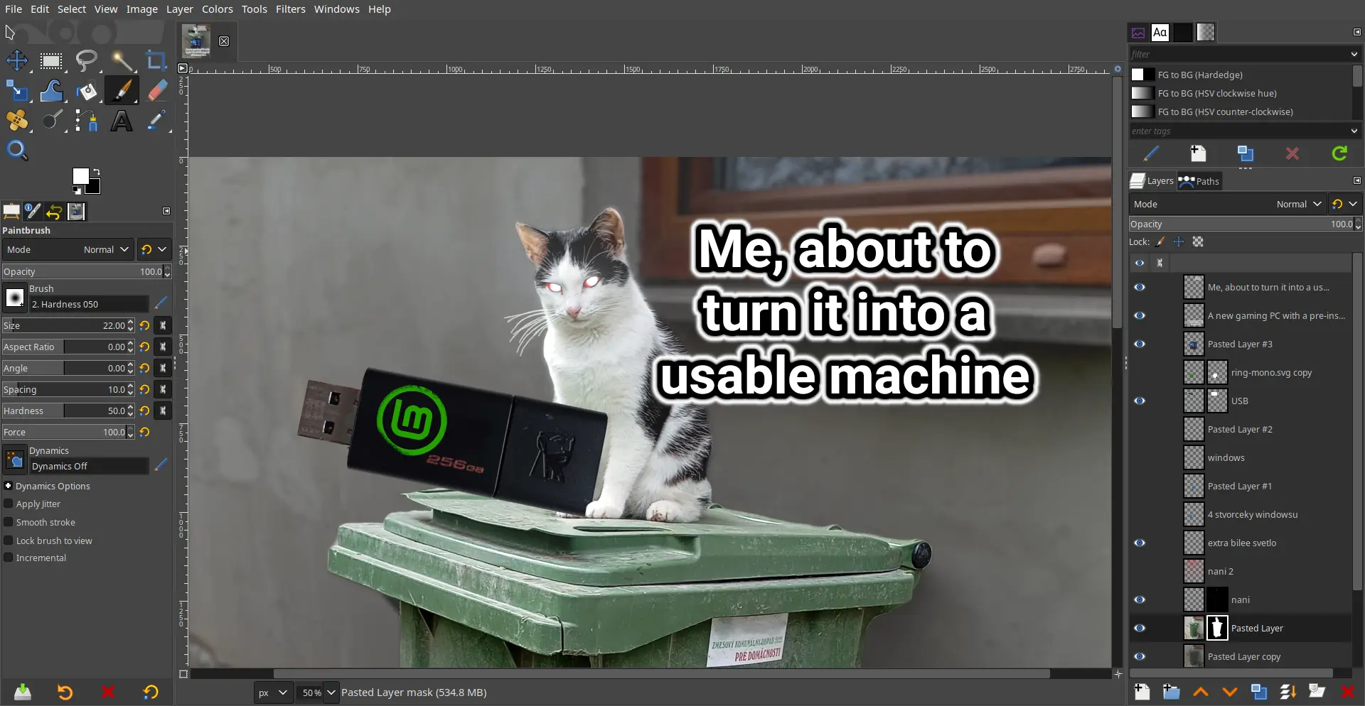
The damn thing was written by a couple of College Students who had no experience with graphic arts and man does it show. The UI has been the number #1 complaint since the 1.0 release back in 1998; how it's never been updated / overhauled is simply beyond me.
It looks good to me...
Why? Looks basically the same as photoshop, which everybody seems to love.
Among other things:
You can change the icon theme in the settings to a color one. That's what I always do. The scaling can be changed as well.
May I ask what are some of the arcane options supposed to be?
How do you change scaling of buttons?
Not at PC for a few days but IIRC I was overwhelmed whenever going through any drop down menu.
Edit > Preferences > Interface > Icon Theme > Custom icon size
Newer versions of Photoshop have like 8 buttons and a toolbar which is terrible imo.