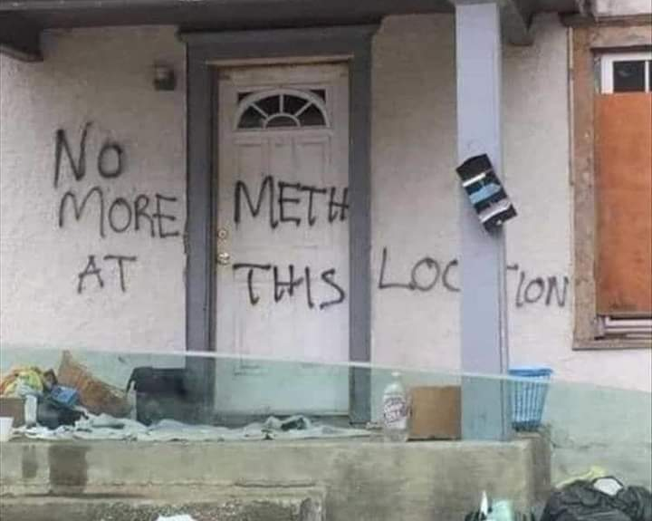
I like how it seems like the "No" was added afterwards
NoSafetySmokingFirst
Welcome to NoSafetySmokingFirst!
For images where the text reads correctly left to right, but visual cues (like colouration, vertical proximity, or horizontal separation) lead you to try to read it top to bottom.
This is similar to, but distinct from, the more widely known “DontDeadOpenInside” format. In that case, the text reads correctly top to bottom, but visual cues (like colouration, horizontal proximity, or vertical separation) lead you to try to read it left to right.
The post that started it all:
Other related communities:
- [email protected]
- [email protected] (letters arranged in any confusing order)
I think "no more" was added afterwards. If you take them out, the rest of the text is centered.
Oh yeah, you are right
There is a LOT of meth at that location.
All that garbage on the porch says otherwise.
Looks like they switched over to crack instead
